IST Africa · Website · Design system
IST Legal
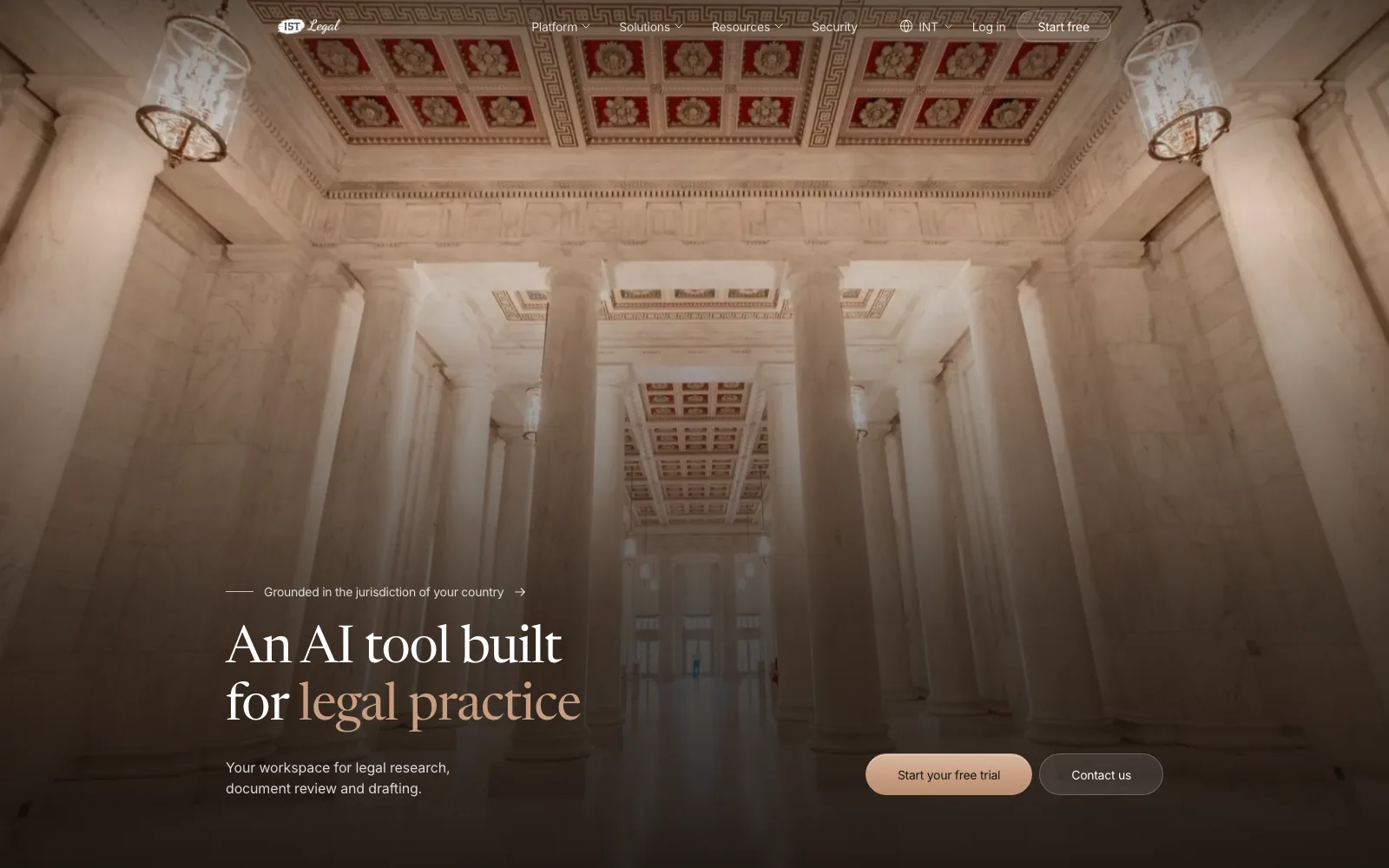
An AI tool built for legal practice.
IST Legal AI is a legal workspace grounded in the law of the country you practise in: research, document review and drafting with sources you can open. The brief for its website was blunt. I redesigned the full multi-page site so a lawyer understands in seconds that this was built for legal work, not a generic AI product with legal copy.
Visit istlegal.ai ↗The problem
“More SaaS than legal.”
That was the feedback on the old site, and it was right. The pages could have sold any software: a dashboard screenshot, a generic chat, a list of features. The claims were not provable either: an accuracy percentage, a university that “trusted” the product, security badges nobody had earned. Lawyers are trained to notice exactly that kind of thing, and the site was asking them to sign up for a tool about verifiable sources with a page that had none.
- 01
It looked like a template.
Nothing on the page was specific to law, or to Rwanda and Kenya.
- 02
It overclaimed.
Accuracy figures, badges and endorsements that could not be backed up.
- 03
It showed nothing real.
Generic AI conversations instead of legal work with sources.
The design question
How does a website prove it was built for legal work before anyone signs up?
Decision 01 · Show the law, separately
The analysis and the law it relies on are always visibly apart.
That one rule became the concept for the whole site. Instead of screenshots, the pages hold five live, illustrative demos: a cited answer, a jurisdiction switch, case law, legislation and a contract review where obligations, risks and inconsistencies are marked in the document itself. In every one the AI’s reading sits on one side and the source it rests on sits on the other, and you can open the source. Each demo is labelled “Illustrative example”, because a believable demo and a real case are not the same thing.
Decision 02 · Say less, prove more
Every claim on the site has a line in a ledger.
Before writing a word I audited the old site’s claims into an evidence ledger: what it said, what we could show for it, keep or cut. The accuracy percentage, the “trusted by” university and the compliance badges went. Security is written as what the platform is designed to support, with no badges. Where the client’s numbers are still being confirmed, the page says so, in public. A site about verifiable sources has to be one.
What we cut
- “95% accuracy” and other figures nobody could source.
- A university named as trusting the product.
- GDPR and SOC 2 badges that had not been earned.
- Stock testimonials, until real ones arrive.
Decision 03 · Jurisdiction first
One site, three countries, and the law changes with the flag.
The product is only useful inside a jurisdiction, so the site is built the same way. There is an international version and one each for Rwanda and Kenya; the hero badge, the examples in the demos and the pricing follow the country. On the Rwandan site the hero carries imigongo panels, and prices are in francs. A lawyer in Kigali should never have to translate the page into their own practice.
Decision 04 · Paper, not dashboard
A warm page, one clay accent, and a serif for the titles.
The look started from a template I measured carefully, then rebuilt on a warm paper palette with a single clay accent, so the product demos carry the colour. After the hackathon review the reviewers asked for the one thing a legal reader expects and a SaaS page never has: a serif. Titles moved to Newsreader; everything else stayed in Inter. One token set runs every page, and the demos are built from the same components the app uses.
- 19widths checked, 320 to 1920px, zero overflow
- 0WCAG 2.2 AA violations; accessibility score 100
- 99–100Lighthouse on desktop
Where it stands
Chosen, shipped, still being confirmed.
The redesign was built in a company hackathon and chosen over three other prototypes; their best ideas, the serif, the security page and the apps section, were merged in. Two rounds of client feedback followed, and the site is live. The interim numbers on the page and the testimonials are still waiting on the client, and they say so until then.
- 3country versions: international, Rwanda, Kenya
- 5live demos, each one labelled illustrative
- 4 wksfrom brief to the hackathon decision
What I would do differently
Start from the ledger, not the layout.
I designed pages first and audited claims second, which meant redesigning sections once the evidence turned out thinner than the copy. Next time the ledger comes first: decide what we can prove, then design the page that proves it.